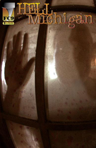
 Hell, Michigan #1
by Dan Jolley & Clint Hilinski
In the town of Hell, it's not just one house that's haunted--it's the whole town! Regina, newly moved into town, suspects that Hell is possessed, and after an incident she teams up with Dixon & Diana Cole--her real estate agents--and a few other town notables to determine what exactly is going on and how they can rid their town of its evil. Jolley sets up a strong story with several interesting, though at this point largely two-dimensional, characters. But the comic is hampered somewhat by Hilinski's art; while his storytelling is strong, his character work is stiff and struggles to avoid being influenced by bad mid-90's Image-style, a struggle he doesn't always win. In addition, while the backgrounds are rendered fine, they are incredibly generic; this could be any old suburban community. When naming a series after a place, that place should be a character in its own right, and that needs to come across in the art.
Rating: 2.5 (of 5)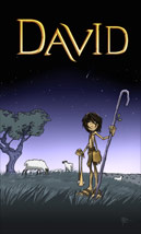 David: Shepherd's Song #1
by Royden Lepp
Sitting in solitude on his throne, the biblical King David thinks back to simpler days when he was but a shepherd, before the prohpet Samuel came and changed his life forever. This is a faithful retelling of the well-known story from I Samuel, greatly expanded upon to give depth to the characters and provide a little drama. Lepp has a talent for characters, storytelling and setting. David is presented as a scrawny kid, but still one you believe could herd a flock of sheep and wrestle with a lion. The scenes with David are mostly silent, but you never have trouble telling what is going on, and the fight between David and a predatory lion is exciting and tension-filled. Reproduced directly from pencils the art gets a bit scratchy at times, and while the color palatte is a bit drab, it does serve to heighten the sense that the Israeli countryside where David watches over his flock is a harsh and unforgiving place. There are so few good comics with religious themes that it is a pleasure to see one that is done well. Community Comics, publishing through Alias, has as its mission "to package professional, high quality, entertaining comic books with a Christian focus"--if all of their products are as strong as
David: Shepherd's Song I'll have no complaints.
Rating: 3.5 (of 5)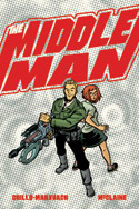 The Middle Man #1
by Javier Grillo-Marxuach & Les McClaine
Wendy Watson thinks that her temp work at A.N.D. Technologies ("Scrambling Your D.N.A.!") is going to be just another receptionist job. But it turns out that A.N.D. is one of those crazy laboratories that you only find in comics (e.g. STAR Labs), and when a huge ugly alien beastie escapes and wrecks havoc she is saved from certain destruction by The Middle Man, a mysterious agent with a high tech weaponry. The Middle Man is impressed by Wendy's coolness under pressure, and before she knows it she is being recruited into whatever mysterious organization he works for. It all makes for an entertaining story with plenty of action, and while so far it's all set-up, Wendy makes for an intriguing character. The art by McClaine is strong, although there's an overreliance on one single zip-a-tone pattern which I found annoying. Still, it's a good debut for this Viper Comics series, one that makes me want to read more.
Rating: 3 (of 5)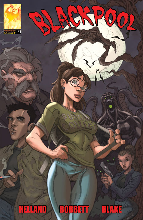 Blackpool #1
by Jonathan Helland & Terrell Bobbett
Another horror series named after the town in which it is set. This time it's the fictional Blackpool, Vermont, the sleepy home of Dunsany College. New freshman Annabelle MacAleister has been having nightmares about being murdered ever since she was seven-years-old, and on her first night at Dunsany she dreams about being the subject of a human sacrifice, her heart cut out of her body while she lies immobile on a stone slab. But the next day a heartless body of a fellow student is discovered on the college grounds, and Annabelle begins to think that there might be more to her disturbing dreams than she previously thought--what if she is dreaming of actual murders. Annabelle ends up confiding in one fo the FBI Agents assigned to solve the ritual murder, and the story is off and running. It appears that Blackpool is a town with many secrets, and as a horror story set in a small New England town you know that some of them will end up being Lovecraftian in nature. Helland brings strong characters and a good main story, and it appears that he has put thought into the background of the town and stories of the side characters as well. Bobbett's art is strong, reminiscent of Humberto Ramos, although not as exagerated. The only misfire is the reproduction of the color art; the paper is too cheap for the dark colors, and the whole affair ends up looking murky. This Phenomenon Comics production needs better quality paper.
Rating: 3 (of 5)